epiworldPy#
This Python package is a wrapper of the C++ library epiworld. It provides a general framework for modeling disease transmission using agent-based models. Some of the main features include:
Fast simulation with an average of 30 million agents/day per second.
One model can include multiple diseases.
Policies (tools) can be multiple and user-defined.
Transmission can be a function of agents’ features.
Out-of-the-box parallelization for multiple simulations.
From the package’s description:
A flexible framework for Agent-Based Models (ABM), the epiworldR package provides methods for prototyping disease outbreaks and transmission models using a C++ backend, making it very fast. It supports multiple epidemiological models, including the Susceptible-Infected-Susceptible (SIS), Susceptible-Infected-Removed (SIR), Susceptible-Exposed-Infected-Removed (SEIR), and others, involving arbitrary mitigation policies and multiple-disease models. Users can specify infectiousness/susceptibility rates as a function of agents’ features, providing great complexity for the model dynamics. Furthermore, epiworldR is ideal for simulation studies featuring large populations.
Current available models:
ModelDiffNetModelSEIRModelSEIRCONNModelSEIRDModelSEIRDCONNModelSEIRMixingModelSIRModelSIRCONNModelSIRDModelSIRDCONNModelSIRLogitModelSIRMixingModelSISModelSISDModelSURV
Bindings exist for other languages, namely R.
Installation#
Installation can be preformed through pip (pip installs packages).
pip install epiworldpy
If there’s a feature that’s only available on the repository, and hasn’t yet been published to PyPi, please create an issue so we know to get on publishing. In the meantime, you can clone the repository though Git, and install locally.
git clone https://github.com/uofUEpiBio/epiworldpy
cd epiworldpy

git checkout $WANTED_COMMIT
pip install .
Examples#
This Python package includes several popular epidemiological models, including SIS, SIR, and SEIR using either a fully connected graph (similar to a compartmental model) or a user-defined network.
SIR model using a random graph#
This Susceptible-Infected-Recovered model features a population of 100,000 agents simulated in a small-world network. Each agent is connected to ten other agents. One percent of the population has the virus, with a 70% chance of transmission. Infected individuals recover at a 0.3 rate:
# Loading the module
import epiworldpy as epiworld

# Create a SIR model (susceptible, infectious, recovered).
covid19 = epiworld.ModelSIR(
  name              = 'COVID-19',
  prevalence        = 0.01,
  transmission_rate = 0.7,
  recovery_rate     = 0.3
)

# Adding a Small world population.
covid19.agents_smallworld(n = 100000, k = 10, d = False, p = .01)

# Run for 50 days with a seed of 1912.
covid19.run(50, 1912)
_________________________________________________________________________
|Running the model...
|||||||||||||||||||||||||||||||||||||||||||||||||||||||||||||||||||||||||

<epiworldpy._core.ModelSIR at 0x7f60a86c9cf0>
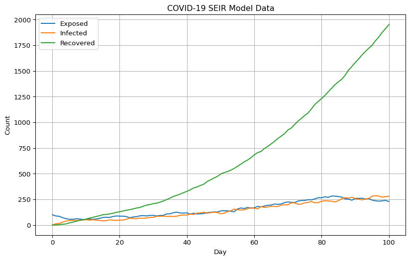
We can now visualize the model’s compartments/outputs:
import numpy as np
import matplotlib.pyplot as plt

# Get the data from the database
history = covid19.get_db().get_hist_total()

# Extract unique states and dates
unique_states = np.unique(history['states'])
unique_dates = np.unique(history['dates'])

# Remove some data that will mess with scaling
unique_states = np.delete(unique_states, np.where(unique_states == 'Susceptible'))

# Initialize a dictionary to store time series data for each state
time_series_data = {state: [] for state in unique_states}

# Populate the time series data for each state
for state in unique_states:
  for date in unique_dates:
    # Get the count for the current state and date
    mask = (history['states'] == state) & (history['dates'] == date)
    count = history['counts'][mask][0]
    time_series_data[state].append(count)

# Start the plotting!
plt.figure(figsize=(10, 6))

for state in unique_states:
  plt.plot(unique_dates, time_series_data[state], label=state)

plt.xlabel('Day')
plt.ylabel('Count')
plt.title('COVID-19 SEIR Model Data')
plt.legend()
plt.grid(True)
plt.show()

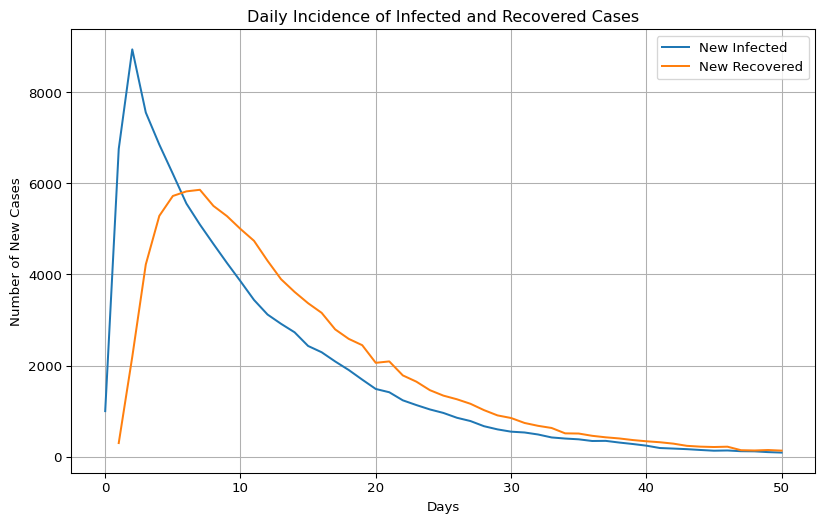
Let’s plot model incidence.
import pandas as pd

# Get the data from the database.
transition_matrix = pd.DataFrame(covid19.get_db().get_hist_transition_matrix(False))

# Subsetting rows where states_from != states_to.
transition_matrix = transition_matrix[
  transition_matrix['states_from'] != transition_matrix['states_to']
]

# Selecting only those where counts > 0
transition_matrix = transition_matrix[
  transition_matrix['counts'] > 0
]

daily_incidence = transition_matrix.groupby(['dates', 'states_to'])['counts'].sum().unstack()

# Plot!
plt.figure(figsize=(10, 6))
plt.plot(daily_incidence.index, daily_incidence['Infected'], label='New Infected')
plt.plot(daily_incidence.index, daily_incidence['Recovered'], label='New Recovered')

plt.title('Daily Incidence of Infected and Recovered Cases')
plt.xlabel('Days')
plt.ylabel('Number of New Cases')
plt.legend()
plt.grid(True)
plt.show()

SEIR model with a fully connected graph#
The SEIR model is similar to the SIR model but includes an exposed state. Here, we simulate a population of 10,000 agents with a 0.01 prevalence, a 0.6 transmission rate, a 0.5 recovery rate, and 7 days-incubation period. The population is fully connected, meaning agents can transmit the disease to any other agent:
model = epiworld.ModelSEIRCONN(
  name              = 'COVID-19',
  prevalence        = 0.01,
  n                 = 10000,
  contact_rate      = 10,
  incubation_days   = 7,
  transmission_rate = 0.1,
  recovery_rate     = 1 / 7
)

# Add a virus.
covid19 = epiworld.Virus(
  name = "COVID-19",
  prevalence = 0.01,
  as_proportion = True,
  prob_infecting = 0.01,
  prob_recovery = 0.6,
  prob_death = 0.5,
  post_immunity = -1,
  incubation = 7
)
model.add_virus(covid19)

# Run for 100 days with a seed of 132.
model.run(100, 132)
Computing some key statistics.
# ...
We can get the effective reproductive number, over time, too:
reproductive_data = covid19.get_db().get_reproductive_number()

# Start the plotting!
plt.figure(figsize=(10, 6))

for virus_id, virus_data in enumerate(reproductive_data):
    average_rts = list()

    for date_data in virus_data:
        if not date_data:
            continue

        keys_array = np.array(list(date_data.values()), dtype=np.float64)
        average_rts.append(np.mean(keys_array))

    plt.plot(range(0, len(virus_data)-1), average_rts, label=f"Virus {virus_id}")

plt.xlabel('Date')
plt.ylabel('Effective Reproductive Rate')
plt.title('COVID-19 SEIR Model Effective Reproductive Rate')
plt.legend()
plt.grid(True)
plt.show()
Let’s do the same for generation time:
from collections import defaultdict

generation_time = covid19.get_db().get_generation_time()
agents = generation_time['agents']
viruses = generation_time['viruses']
times = generation_time['times']
gentimes = generation_time['gentimes']

# Data formatting
unique_viruses = np.unique(viruses)
data = defaultdict(lambda: defaultdict(list))

for agent, virus, time, gentime in zip(agents, viruses, times, gentimes):
    data[virus][time].append(gentime)

average_data = {virus: {} for virus in unique_viruses}

for virus, time_dict in data.items():
    for time, gentime_list in time_dict.items():
        average_data[virus][time] = np.mean(gentime_list)

# Plotting
plt.figure(figsize=(10, 6))
for virus, time_dict in average_data.items():
    times = sorted(time_dict.keys())
    gentimes = [time_dict[time] for time in times]
    plt.plot(times, gentimes, label=f'Virus {virus}')

plt.xlabel('Date')
plt.ylabel('Generation Time')
plt.title('COVID-19 SEIR Model Generation Time')
plt.legend()
plt.grid(True)
plt.show()
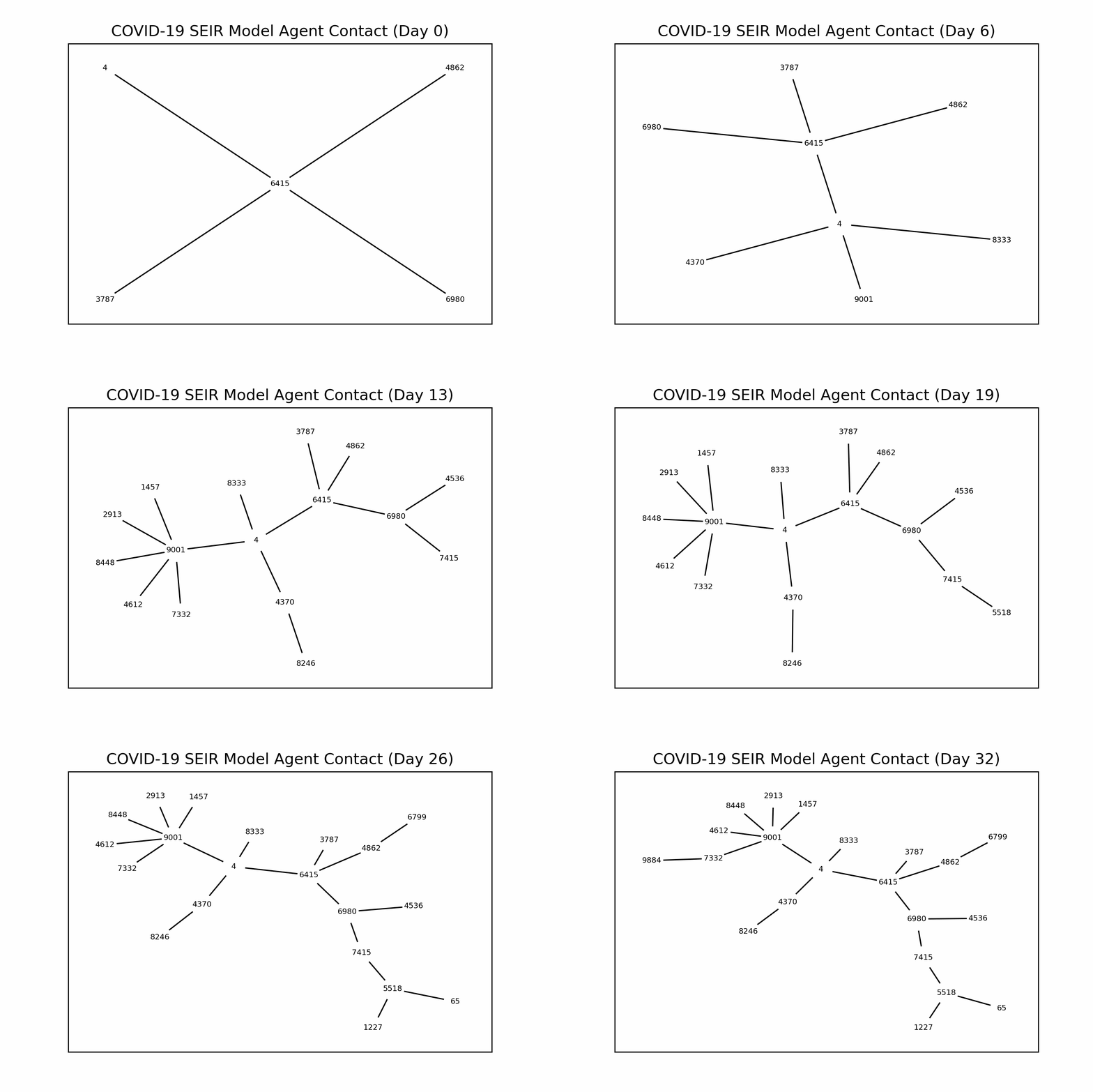
Transmission Network#
This example shows how we can draw a transmission network from a simulation. The following code simulates a population of 500 agents in a small-world network. Each agent is connected to ten other agents. One percent of the population has the virus, with a 50% chance of transmission. Infected individuals recover at a 0.5 rate:
import networkx as nx
from matplotlib.animation import FuncAnimation

model = epiworld.ModelSIR(
  name           = "COVID-19",
  prevalence     = .01,
  transmission_rate = 0.5,
  recovery       = 0.5
)

model.agents_smallworld(n = 500, k = 10, d = False, p = 0.01)
model.run(50, 1912)

transmissions = model.get_db().get_transmissions()
start = transmissions['source_exposure_dates']
end = transmissions['dates']
source = transmissions['sources']
target = transmissions['targets']
days = max(end)

graph = nx.Graph()
fig, ax = plt.subplots(figsize=(6,4))

# Animation function
to_track = { source[0] }
def update(frame):
    ax.clear()

    agents_involved_today = set()
    agents_relationships_we_care_about = []

    # Get only the agents involved in the current frame.
    for i in range(len(start)):
        if start[i] <= frame <= end[i]:
            agents_involved_today.add((source[i], target[i]))

    # Get only today's agents who have some connection to agents
    # we've seen before.
    for agent in agents_involved_today:
        if agent[0] in to_track or agent[1] in to_track:
            to_track.add(agent[0])
            to_track.add(agent[1])
            graph.add_edge(agent[0], agent[1])

    # Lay and space them out.
    pos = nx.kamada_kawai_layout(graph)

    options = {
        "with_labels": True,
        "node_size": 300,
        "font_size": 6,
        "node_color": "white",
        "edgecolors": "white",
        "linewidths": 1,
        "width": 1,
    }

    # Graph!
    nx.draw_networkx(graph, pos, **options)
    ax.set_title(f"COVID-19 SEIR Model Agent Contact (Day {frame})")

ani = FuncAnimation(fig, update, frames=int(days/3), interval=200, repeat=False)
plt.show()

Multiple Simulations#
epiworldpy supports running multiple simulations using the
run_multiple function. The following code simulates 50 SIR models with
1000 agents each. Each agent is connected to ten other agents. One
percent of the population has the virus, with a 90% chance of
transmission. Infected individuals recover at a 0.1 rate. The results
are saved in a dataframe:
model = epiworld.ModelSIRCONN(
  name = "COVID-19",
  prevalence = 0.01,
  n = 1000,
  contact_rate = 2,
  transmission_rate = 0.9,
  recovery_rate = 0.1
)

saver = epiworld.Saver("total_hist", "reproductive")
saver.run_multiple(model, 100, 50, nthreads=2)
Starting multiple runs (50)
_________________________________________________________________________
_________________________________________________________________________
||||||||||||||||||||||||||||||||||||||||||||||||||||||||||||||||||||||||| done.

<epiworldpy._core.Model at 0x7f60a86c7c30>
Let’s grab the results.
ans = saver.run_multiple_get_results("total_hist")
ans["total_hist"][0:10]
API#
You can find API documentation on the API documentation page.
Existing Alternatives#
There exist a multitude of existing ABM frameworks/libraries available for Python. See the below (non-exhaustive) list.
MESA
LDG
BPTK-Py
A comparison table will be added at a later date. Want to contribute that, or add a project we missed? Submit a PR!
Code of Conduct#
The epiworldPy project is released with a Contributor Code of Conduct. By contributing to this project, you agree to abide by its terms.
