Plot a SensIAT_within_group_model Object
Source: R/autoplot.R
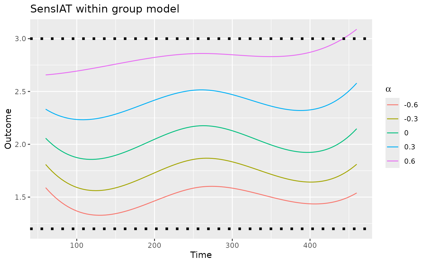
autoplot.SensIAT_within_group_model.RdThis creates a line plot for a SensIAT_within_group_model object.
The horizontal axis represents time, and the vertical axis represents the
expected marginal outcome given the sensitivity parameter alpha.
Examples
# Note: example takes a few seconds to run.
# \donttest{
object <-
    fit_SensIAT_within_group_model(
        group.data = SensIAT_example_data,
        outcome_modeler = fit_SensIAT_single_index_fixed_bandwidth_model,
        id = Subject_ID,
        outcome = Outcome,
        time = Time,
        knots = c(60, 260, 460),
        End = 830,
        alpha = c(-0.6, -0.3, 0, 0.3, 0.6),
        intensity.args = list(bandwidth = 30)
    )
ggplot2::autoplot(object) +
    # Title not included
    ggplot2::ggtitle("SensIAT within group model") +
    # Nor are bounds on reasonable values of alpha
    ggplot2::geom_hline(yintercept = c(1.2, 3), linetype = "dotted", linewidth = 1.5)

# }
# }